Reviewed By: Rae Eggleston
Available: Paperback and also partially available online through: https://sensible.com/dont-make-me-think/

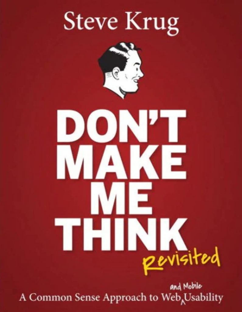
In Don’t Make Me Think, Revisited (Krug, 2014), there is a great deal of timeless information for the web and for user experience in general. This book is a quick and simple guide for anyone who needs help with UX, but also is great for those trying to break into the field as well.
Some of my favorite chapters include Chapter 5: Omit Needless Words. Having a background in graphic design, I already knew this to be true. It is a frequently passed-around piece of information in the design world that one should always write for a third grade reading level and no higher, and I consider omitting needless words and simplifying complicated words as part of this process.
Furthermore, having to look up a more complicated word would almost certainly lead the user away from the intended site, which is not ideal for anyone in the slightest.
Another important chapter in this book includes Chapter 12: Accessibility and you. It goes over some basic rules that would make most websites more accessible for everyone (that are relatively simple to implement). For example, using alt text in images is a very easy way to make an inaccessible website more accessible. Making sure that items are high contrast is another way.
Having this book on hand any time user experience is involved would more than likely be a good idea, as everything is laid out for fast navigation and easy adaptation to real-world situations.
References
Krug, S., (2014). Don’t make me think, revisited: A common sense approach to web and mobile usability. New Riders.
